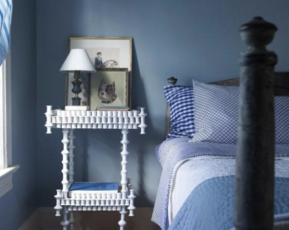
Choosing interior paint is not just about picking a color off a fan deck. It is about deciding how your space will feel in the morning, in the afternoon, and at night. Light changes everything. A shade that looks calm and neutral in the store can feel cooler, warmer, brighter, or heavier once it is on your walls. If you have ever painted a room and felt unsure afterward, lighting was likely the reason.
Start With the Natural Light in Your Room
Before committing to a color, take a close look at the light in your space. The direction your windows face has a major impact on how interior paint appears throughout the day. Trends matter less than how a color performs in your actual home.
North Facing Rooms Feel Cooler
If your room faces north, you are working with cooler indirect light. That light can mute warmth and make some neutrals appear slightly gray. You can balance this by choosing interior paint with a soft warm undertone. Creamy whites and warm greige shades often create a more inviting feel. Benjamin Moore colors such as White Dove or Edgecomb Gray tend to hold their warmth without turning yellow.
South Facing Rooms Feel Brighter and Warmer
South facing rooms receive steady sunlight for most of the day. That warm light enhances yellow and red undertones and can make beige or tan feel stronger than expected. When you test interior paint in a bright room, you may find that a slightly softer version of your first choice feels more comfortable. Sunlight naturally intensifies color, so subtle adjustments go a long way.
East and West Facing Rooms Shift Throughout the Day
East facing rooms glow warmly in the morning and cool off later in the day. West facing rooms start softer and become warmer toward evening. Because the light changes, your interior paint can look different from one hour to the next. Paint large samples on more than one wall and live with them for a day or two. Seeing the shift in real time helps you choose with confidence.
Pay Attention to Artificial Lighting
Once daylight fades, your light bulbs take over. Warm white bulbs cast a golden glow that deepens warm tones and softens cooler shades. Daylight bulbs create a crisper effect and highlight blue or gray undertones.
Before finalizing interior paint, make sure your fixtures and bulb temperature are set. If you plan to update lighting, handle that first. Your paint and lighting should support each other. In kitchens and bathrooms, bright overhead lighting makes undertones more noticeable. In bedrooms and living rooms, softer lamps create a relaxed mood.
If you are choosing a deeper shade, product quality matters. A premium interior paint such as Benjamin Moore Regal Select offers strong coverage and rich pigmentation so darker colors appear smooth and intentional.
Look Closely at Undertones
Every interior paint color carries an undertone. Some whites lean creamy while others feel crisp. Some grays reveal hints of green or violet once they are applied. Lighting draws out those subtle shifts.
Set your samples next to flooring, cabinets, and countertops. Fixed elements influence how color reads. When undertones work together, the room feels cohesive. When they do not, the space can feel slightly unsettled even if you cannot immediately explain why.
Test Interior Paint at Full Scale
Small paint chips are helpful, but they are not enough. You need to see interior paint across a larger surface. Brush generous swatches directly on the wall or use movable sample boards. Check them in the morning light and again in the evening.
Step back and notice how the color shapes the space. Ask yourself whether it reflects enough light and whether it fits the mood you want. Taking this extra time removes doubt and prevents costly repainting.
Think About How You Use the Space
Lighting sets the tone, but daily life finishes the story. In a home office, you may want a shade that supports focus without feeling cold. In a dining room, a deeper tone can feel welcoming under evening light. Bedrooms usually benefit from softer colors that help you unwind.
Sheen also affects how interior paint responds to light. Flat finishes absorb light and minimize surface flaws. Eggshell and satin finishes reflect more light and can subtly brighten a room. Benjamin Moore offers consistent color across finishes so you can select the right option without worrying about unexpected shifts.
Choose Interior Paint With Confidence
Showroom lighting is controlled. Your home is not. Take your time with samples and pay attention to how they look on sunny mornings and cloudy afternoons. Trust what you see in your own space.
When you understand how lighting interacts with interior paint, you make decisions with clarity. The right color will complement your lighting, enhance your furnishings, and create a room that feels balanced every time you walk in.